

In a digital world when attention spans are short and brands have to work harder than ever to be relevant, firms typically go for complicated strategies, new tools, and strong marketing pushes. But they often forget about one of the easiest and most effective ways to grow: visual consistency.
It might not be as exciting as viral methods or as trendy as AI-driven marketing, but it has a big impact on how rapidly a brand grows, how trustworthy it becomes, and how quickly people decide to interact with it. In reality, the top brands in their fields don’t only tell better stories or make better products. Their visual identities are so constant that their audience can tell who they are right away, even without a logo.
Why Visual Consistency Is More Important Than Ever
People judge companies before they ever read a word, so visual consistency is important. Every choice you make about color, style, images, and spacing affects how people see things. When your website, social media, marketing, and product interfaces all look and feel the same, your audience will feel at home. And in psychology, trust grows with familiarity.
The brain thinks something is safer and more reliable when it seems familiar. That trust leads to more clicks, better brand memory, easier conversions, and stronger loyalty. A lot of firms don’t realize how powerful this unseen force is, but those that do develop quicker with less work.
Visual Consistency Is More Than Colors and Fonts
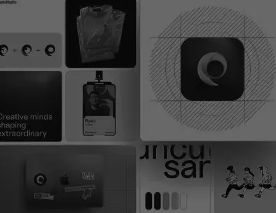
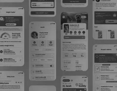
But being consistent doesn’t just mean having the same colors or duplicating your brand font. A full system is what real visual consistency is. The structure of your layouts, the spacing you employ on every design, the rhythm of your font hierarchy, the tone of your images, the personality of your icons, and even the feel of your motion graphics if your brand uses movement are all part of it.
Consistency is the visual language that lets your audience know who you are without you having to say it. When these things come together, you make a brand experience that seems well-planned, polished, and trustworthy.
This amount of constancy has a direct effect on growth. A brand that appears the same across all platforms is easy to spot. The user has less time to make a selection because the brand is already familiar to them. That makes conversions go more smoothly. Inconsistency makes people feel like they can’t trust you, but a consistent identity makes people feel like they can trust you.
Keeping things the same visually leads to real growth
Visual consistency does a lot more than just make things look better. It speeds up things inside the company by giving your staff a clear visual framework to follow. When your team uses the same templates, guidelines, and parts, they can work faster, better together, and not have to start over from scratch.
The end result is better workflows, faster delivery, and content that stays true to the brand even when it’s made in large quantities.This consistency also makes your marketing more profitable. When your graphics are in sync, every post, ad, video, and landing page sends the same message about your business.
Instead of taking the time to remind people of who you are visually, every new piece of information contributes to your ability to be recognized and remembered. This makes campaigns work better without costing more or taking more time.
Core Problem: Consistency Fades as Brands Expand
The problem is that a lot of companies start off consistently but lose it as they develop. When a brand is small and only one designer or marketing lead is in charge, the graphics stay the same. But when teams grow, more people begin to make images.
That’s where things start to get inconsistent. One designer employs a shade of the brand color that is a little bit different. One alters the size of the font. The staff that works on social media tries out fresh layouts. The people that work on the website change the spacing. The brand’s visual consistency slowly fades away, and the viewer can sense that lack of discipline.
This is why the best organizations spend a lot of money on structured workflows, brand manuals, design platforms, and template libraries. It’s not by chance that things stay the same. It happens when people follow rules, write things down, and agree on standards. The brand stays together as it grows when everyone on the team knows the visual language.
Conclusion
In a time when there is a lot of digital competition, visual consistency is one of the easiest but most ignored methods to improve how people see your business. It makes a good first impression, establishes trust, makes the user experience better, saves time for the company, and makes marketing work better. Companies are always looking for new ways to develop, but often the easiest way is the best: make sure that all of your visual touchpoints speak the same language. When your brand is the same everywhere, your audience feels connected, confident, and ready to move on to the next level. That’s when genuine growth happens.
FAQS
Keeping all of a brand’s visuals in line with each other in terms of style, tone, colors, layout, and images is called visual consistency. It builds familiarity, trust, and recognition, which makes people more likely to engage and do better.
When graphics are recognizable and easy to guess, people see the brand as competent and trustworthy. Consistency shows that something is trustworthy, while inconsistency makes things confusing.
Yes, since people make decisions more quickly when they know and trust a brand. Consistent, clean images make things easier for users and improve their experience, which leads to more conversions.
When teams get bigger and more people provide content, visuals might start to drift unless there are solid rules, templates, and design processes in place. If you grow without a plan, things will be inconsistent.
Start by looking over the visuals you already have. Find things that don’t match, set a common style, and make templates that everyone can use. This alone can make a big difference in how well your brand fits with others.